Chapter 14: iptables Log Visualization
The last chapter in the book wraps up with some graphical representations of iptables log data. A picture can quickly illustrate trends in network communications that may indicate a system compromise, and by combining psad with the Gnuplot and AfterGlow project you can see what iptables has to show you.All of the graphical representations in Chapter 14 are reproduced below, along with the data files and Gnuplot directive files. The data source for all of the visualizations is the iptables log data provided by the Honeynet Project in the Scan 34 challenge. You can view all of the visualizations on a single page here if you like.
| Figure | Description | Files |
|---|---|---|
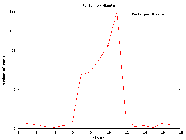
| Figure 14-1 | Traffic Spike: Number of packets to ports per minute | graph, .dat, .gnu |
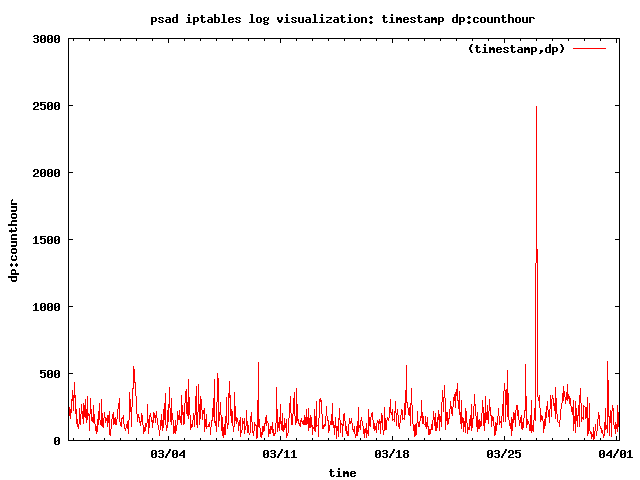
| Figure 14-2 | Traffic Spike: Number of SYN packets to ports per hour | graph, .dat, .gnu |
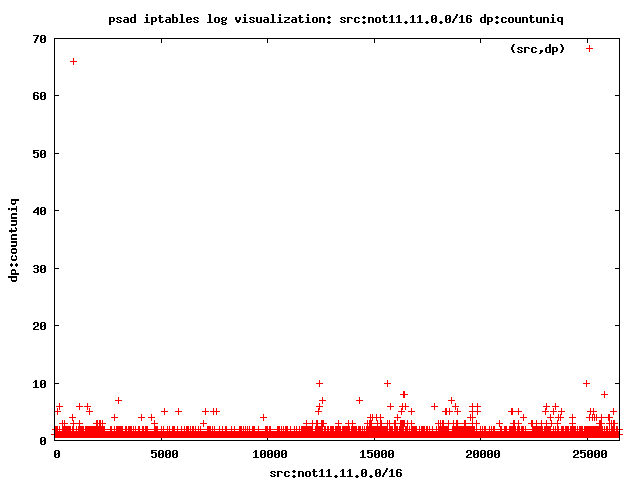
| Figure 14-3 | Port Scan: Source IP addresses vs. number of unique ports | graph, .dat, .gnu |
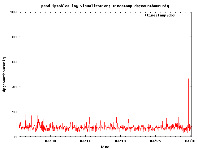
| Figure 14-4 | Port Scan: Time vs. unique ports | graph, .dat, .gnu |
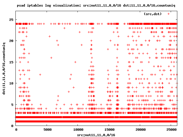
| Figure 14-5 | Port Sweep: External sources vs. number of unique local destinations | graph, .dat, .gnu |
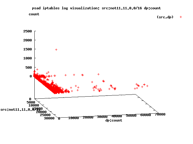
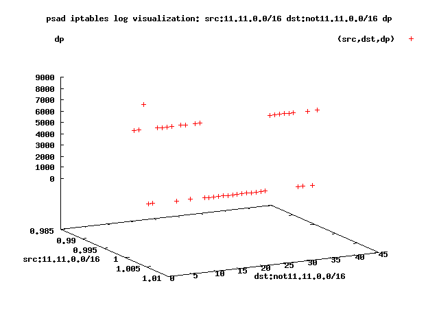
| Figure 14-6 | Port Sweep (3D): External source addresses vs. destination ports vs. packet counts |
graph, .dat, .gnu |
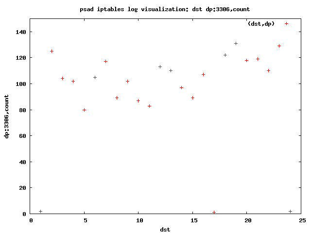
| Figure 14-7 | Port Sweep: MySQL 3306 | graph, .dat, .gnu |
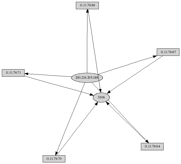
| Figure 14-8 | Link graph of MySQL port sweep | graph |
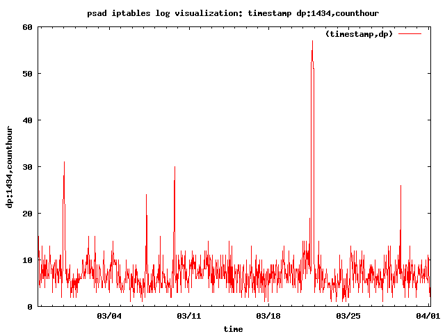
| Figure 14-9 | Slammer worm: packet counts by the hour | graph, .dat, .gnu |
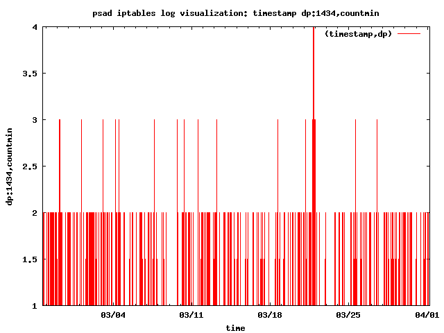
| Figure 14-10 | Slammer worm: packet counts by the minute | graph, .dat, .gnu |
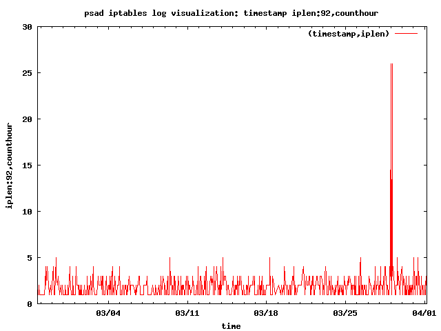
| Figure 14-11 | Nachi worm traffic by the hour | graph, .dat, .gnu |
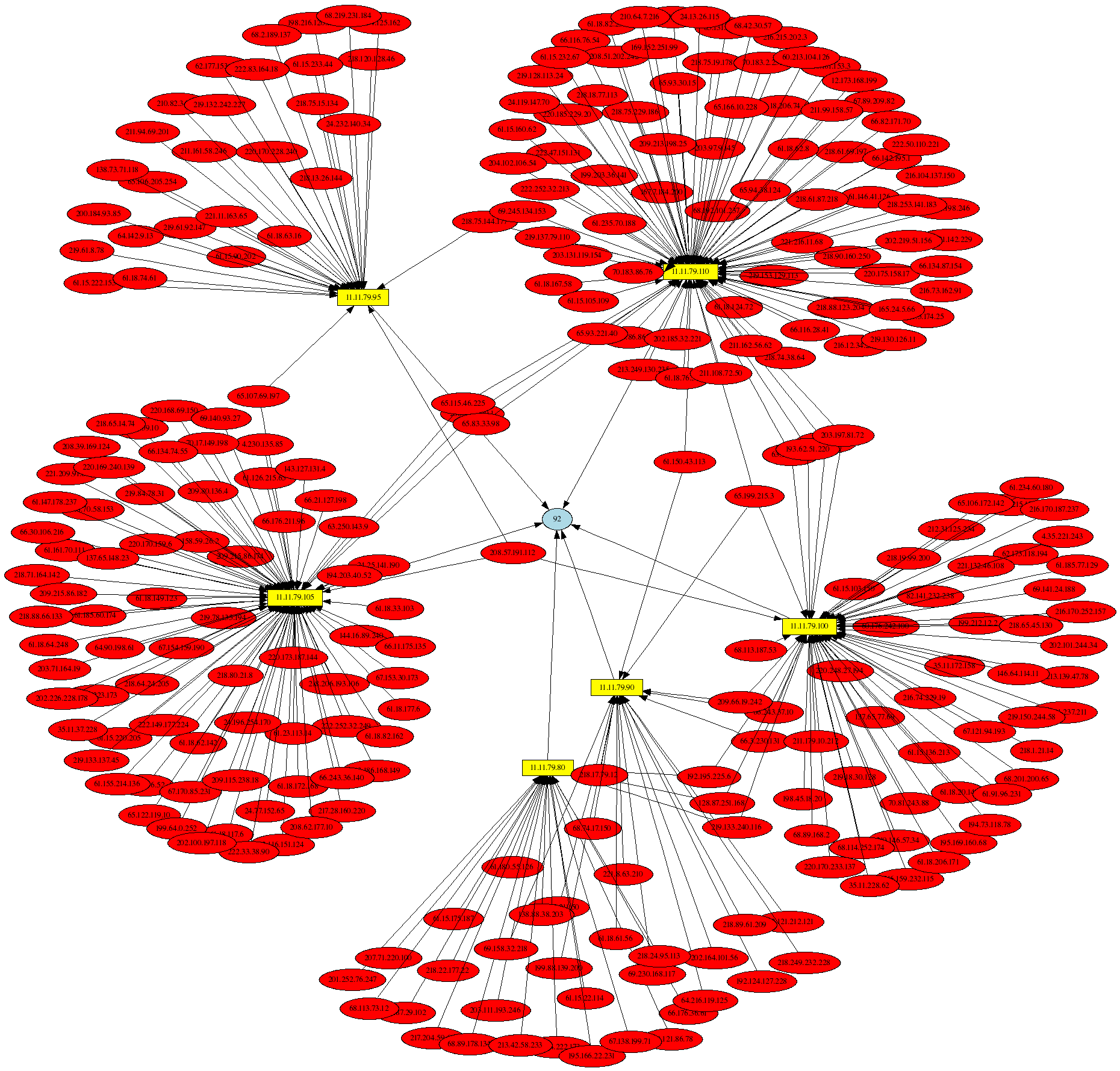
| Figure 14-12 | Link graph of Nachi worm 92-byte ICMP packets | graph |
| Figure 14-13 | Compromised Honeynet system: Point graph of outbound connections | graph, .dat, .gnu |
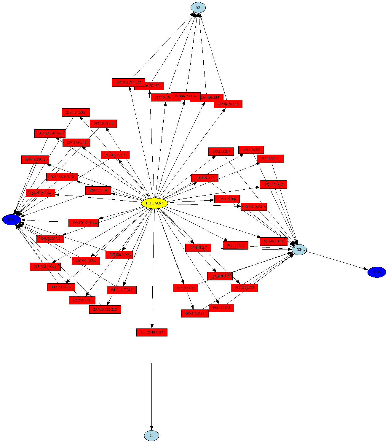
| Figure 14-14 | Compromised Honeynet system: Link graph of outbound connections | graph |


