OSCON 2007 Talk Slides - Iptables Attack Visualization
27 July, 2007

 Yesterday I gave a talk
at the O'Reilly Open Source Convention (OSCON)
entitled Iptables Attack Visualization. Slides can be downloaded
here.
This talk concentrated on the new Gnuplot interface available in psad-2.0.8, and example visualizations of data provided by the Honeynet Project were presented. Both two and three dimensional points graphs can be generated with psad-2.0.8, and these are useful for graphing large data sets; the Scan34 challenge from the Honeynet Project includes over 170,000 lines of iptables log data. Also, link graphs produced with the psad interface to AfterGlow were presented. These graphs are great at expressing relationships between IP addresses and activity such as outbound connections from the Honeynet.
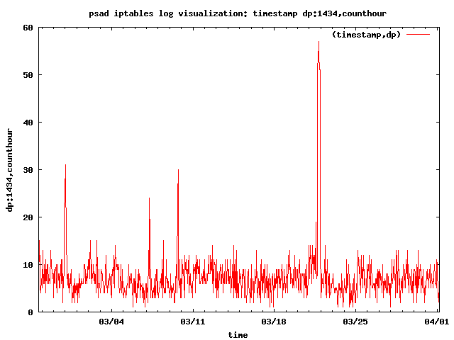
Here is a sample graph of Slammer worm traffic (404-byte packets to UDP port 1434) in the Scan34 challenge data set (seeing the spike in worm traffic is extremely easy with a graph):

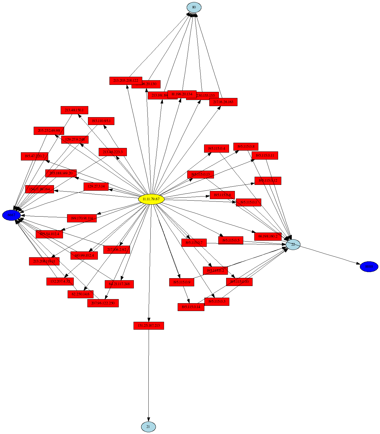
Other activities are visualized in my talk (including port scans, port sweeps, and Nachi worm traffic), but some of the most interesting log messages show outbound connections from the Honeynet over SSH and IRC, and these are clear indicators of a compromised system. Here is a link graph visualization of such activity with the AfterGlow project:

With psad-2.0.8 released, you can graph all of that iptables log data you have laying around on your system, and sometimes some interesting outliers can show up that indicate malicious activity.


